

The Importance of User Friendly Websites For Mobile
Optimising for Mobile should Be one of your First Priorities
Out of 7 billion people in the world an average of 6.8 billion are mobile users, and chances are most of these people have access to the internet so it’s super important that you have user friendly websites which are going to be responsive on mobile.
I find it pretty hard to believe that there are thousands of websites out there that haven’t and aren’t optimising for mobile.
We’re in the 21st century, companies are releasing smartphone after smartphone so if you’re a business who isn’t optimising for mobile then now’s the time you should be re-thinking your online strategy.
To kick things off it’s probably a good idea that I tell you exactly what mobile optimisation is.
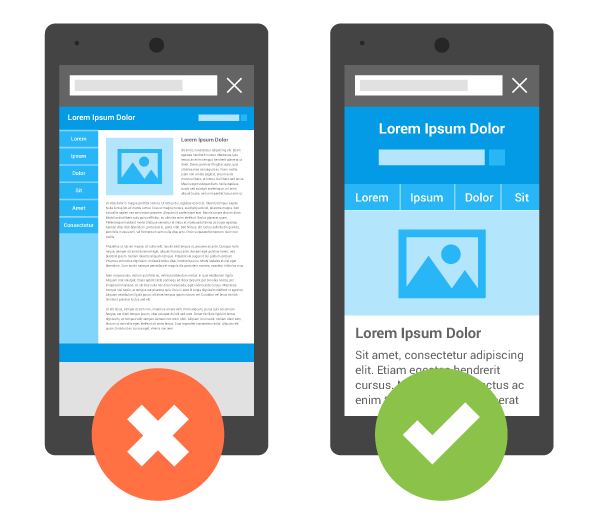
Mobile optimisation is really what it says, it’s taking a website and ensuring that it is designed, structured and responsive on a mobile device, you’ll also know if you’re looking at user friendly websites on your mobile device if it fits your screen width; so no more more zooming and side-wards scrolling.
Implementing Mobile Optimisation for User Friendly Websites
Now that you know the initial part of how website optimisation for mobile works, it’s time to get into the juicy stuff, it’s time to tell you about actually optimising for mobile and what practices need putting in place.
Ensuring that you are optimising your titles and meta description is a crucial part of user friendly websites for mobiles.
You need to be conscious of what information you are using, you want to make sure that all the relevant details are there but they aren’t taking up too much room because remember it’s going to be seen on a much smaller screen compared to a desktop.
Long fingers, short fingers, fat fingers and stumpy fingers, you need to cater for them all!
Make sure any buttons are a good size, not too small or too big; avoid the accidental clicks.
Schema, Schema, Schema, that’s what it’s all about when optimising for mobile!
Schema.org is a brilliant way for creating user friendly websites for mobile devices as it will be much more recognisable opposed to the way it is on a desktop, it is guaranteed to stand out and make a huge difference.
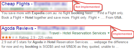
If you want to know more on Schema Markup and how it improves click through rate then I advise you to read our expert post on it!
When people are out and about using the internet on their mobile then chances are they are searching for something local and this is why optimising for local searches is paramount.
Local SEO is all about the NAP; Name, Address, Phone Number.
There Is Plenty More To Learn About Website Optimisation For Mobile
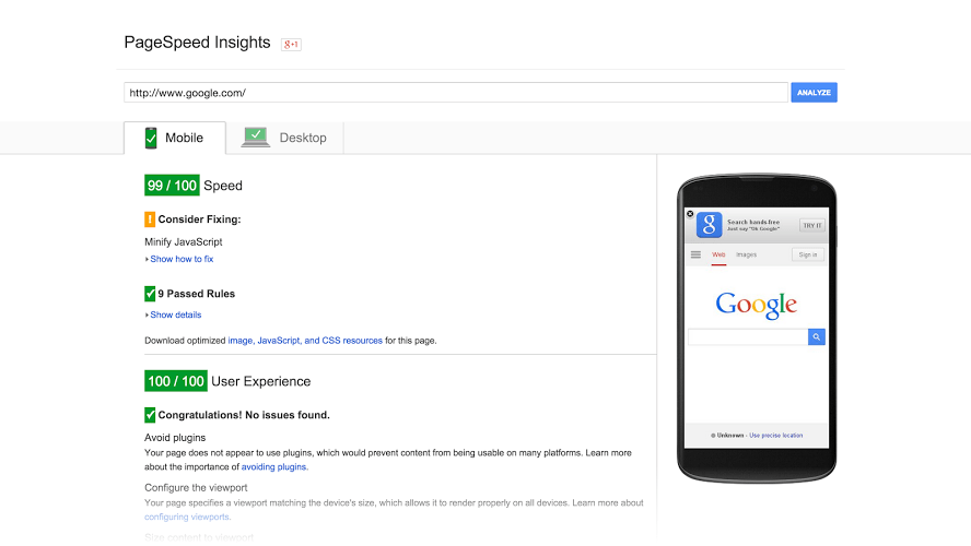
Another key aspect when optimising for mobile is page speed.
Page speed is so much more important on a mobile device in comparison to a desktop, mobile users want quick results otherwise they are just going to bounce and you’ll be saying hello to a high bounce rate percentage which is never good!
To improve page speed there are a few areas you can look at:
- Minify Code
- Reduce Redirects
- Leverage Browsing Cache
- Optimise Images
- Improve Server Response Time
There are other ways in which you can improve page speed for mobile devices but that’s a post for another day and besides, you’ll definitely notice a difference by using these 5 pointers!
A definite factor that has to be put into place when it comes to user friendly websites for mobile devices is that pop-ups should NOT be included.
Pop-up advertisements are annoying enough on a desktop when there is plenty of room to get rid of them, imagine the level of annoyance that occurs on a mobile when it’s a smaller screen and difficult to click away from, if you include pop-ups then you can say see ya to some of your website visitors!
Georgia’s Final Thought
For this one my final thought has got to be optimise for mobiles!
If it isn’t clear enough, user friendly websites for mobile are crucial and really need attention paying to.
By implementing the points I have covered you’ll soon see your mobile traffic increase and will have a much better online mobile appearance.
There is definitely more areas which could be covered when it comes to website optimisation for mobile so if you want to know more and have our expert team of SEO guru’s jazz up your website and get you ranking in the search engine then it’s best you give us a call; 0151 329 2988.
Hi my name is Peter, I run Merseyside Web and I'm passionate about on-line marketing. Interested in my business working for yours? Our £77 per week SEO services mean that it is now cheaper to rank a local site with Liverpools #1 SEO , than most of our competitors occupying the lower positions on Google! Check out our £77pw SEO services!
Follow us on: